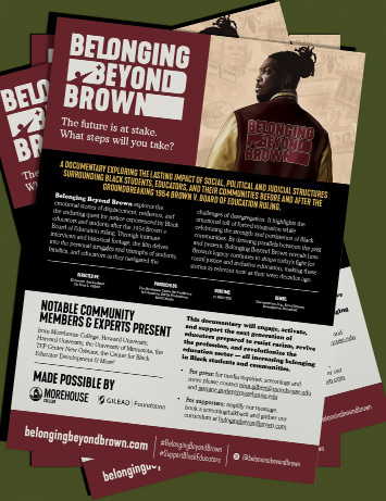
As the film neared completion, Streamlined Media and Communications, led by Morehouse alumni Darren Martin Jr. ‘15 and Ahmad Barber ‘13, took on the work of building the visual and strategic identity that would carry Belonging Beyond Brown into the world. From key art and design to foundational marketing materials and release communications, the team crafted a brand presence that matched the depth and intention of the film itself. Every creative decision, from the imagery to the messaging, was designed to signal the cultural weight of the story and connect with audiences before they ever pressed play.
Crafting the Narrative: Creating the Marketing Communications Strategy and Go-To-Community Messaging for Belonging Beyond Brown
The communications framework for Belonging Beyond Brown was developed by the project’s client and creative team using a thematic structure. These early ideas, drawn directly from the narrative and historical themes explored in the film, formed the foundation for the broader communications strategy. Rather than beginning with outward-facing promotional language, the process first focused on identifying and clarifying the central ideas of belonging, inclusion, loss, reclamation, and a charge for the future, embedded in the documentary itself. This ensured that all messaging would remain grounded in the film’s intent and its historical and cultural context.
Building from this initial framework, the team developed a comprehensive communications system designed to guide how the project would speak to audiences across platforms and formats. This process included articulating the project’s mission and vision statements, identifying primary and secondary audiences, and developing taglines and calls to action to convey the film’s purpose concisely and accessibly.
Particular attention was given to the language used to describe the film and to invite engagement with its themes. The goal was not simply to promote the documentary, but to translate its complex historical and social insights into a clear and resonant information structure that could be understood by diverse audiences. Messaging, therefore, emphasized themes of belonging, educational justice, resilience, and historical memory.
The result of this process was a structured communications architecture capable of supporting a range of outputs, including presentations, one-sheets, digital content, and public programming. By grounding all messaging in the film’s foundational themes, the communications framework ensured consistency across materials while allowing the project to engage communities, educators, and cultural institutions in meaningful ways.
Ultimately, the communications system functions as a promotional tool and as an interpretive guide for the project. It amplifies the voices and perspectives presented in the film while providing a coherent language for discussing its broader implications for education and community life.
Imagining and Engineering the Visual Identity Foundation of Belonging Beyond Brown and Its Numerous Marketing Materials
The visual identity for Belonging Beyond Brown emerged through an iterative design process that closely aligned with the project’s communications framework. Early in development, the team reviewed an initial draft of key artwork produced by an illustration partner. While this draft offered a starting point, the updated brand communications strategy and direction meant that visuals needed to reflect the themes and narrative structure established in the communications strategy more directly.
As a result, the visual identity process was intentionally restarted to ensure alignment between the film’s message and its visual representation. Using the communications framework as a guiding reference, the team developed a cohesive design system that incorporated typography, color palettes, imagery, textures, and graphic motifs inspired by the project’s central themes of belonging, resilience, and historical continuity.
During this phase, the team also examined visual references from influential works within Black cinema and cultural storytelling. One particularly meaningful reference point came from a secondary promotional poster for Spike Lee’s film “Do the Right Thing.” The poster’s emphasis on bold text and a strong visual focal point informed the direction of the new key art. The imagery of Lee wearing a letterman jacket, combined with distinctive elements of Black visual culture, inspired the concept of a central visual anchor that could carry layered symbolic meaning.
Building on this inspiration, the team staged and photographed reference imagery that would later serve as the foundation for a hand-illustrated composition. Illustrator Dorothea Taylor of TP Designs translated these reference photographs into a detailed illustration that reimagined the jacket as a storytelling device. The jacket’s patches became symbolic markers, each representing a key theme or moment within the film, including references to the McDonogh Three and the generational cycle of students becoming educators.
This illustrated key art ultimately became the centerpiece of the project’s visual language. More than a single promotional image, it served as a design system that informed the development of posters, marketing materials, digital assets, and launch graphics. By grounding the visual identity in narrative symbolism and cultural references, the design created a recognizable and meaningful aesthetic that honored both the film’s historical subject matter and the community it represents.